I Hated Slides and Now I Love Them: How I Built a Captivating Keynote
We've all suffered through presentations featuring dense slides brimming with bullet points, inscrutable graphs, and bewildering stats.
But are slides themselves the culprits, or is it about how they are used?
As speakers we all want to deeply engage our audiences, provide them with actionable takeaways, earn rave testimonials, and over-delight our clients.
For years I completely avoided using slides in my keynote presentations. Not because slides can't be effective, but because they rarely are.
Yet, this year, 2023, things changed. I found myself constructing a slide deck for my keynote speeches, eliciting disbelief from my wife (who has endured countless rants about speakers using slides) and confusion from my students (who I've taught to avoid slides).
So what led me to this fundamental shift in approach?
In this article, I'll dissect the factors that changed my viewpoint on using slides and provide actionable recommendations to employ slides without snuffing the life out of your audience.
Let's start by considering the reasons you might not want to use slides.
Slides create friction
Before we talk about my transition to using slides and what I've learned, I should briefly outline why I've always been against them. There are 3 primary reasons:
Slides create a barrier between you and the audience, encouraging them to stare at the screen instead of listen to or engage with you.
Tech invites multiple opportunities for failure - the slides might fail to load, the clicker might stop working, the screen might go out, etc.
Slides lock you into a presentation with little to no opportunity to change directions mid-talk or last minute.
And until this year I stood by these reasons. But then something changed.
Slides can be employed to manage and maintain energy
#1 Keynotes are longer than ever
This year nearly every client has asked for 90-min keynotes. Meanwhile a survey by Decktopus found that audiences prefer presentations that are 10-15 minutes in length.
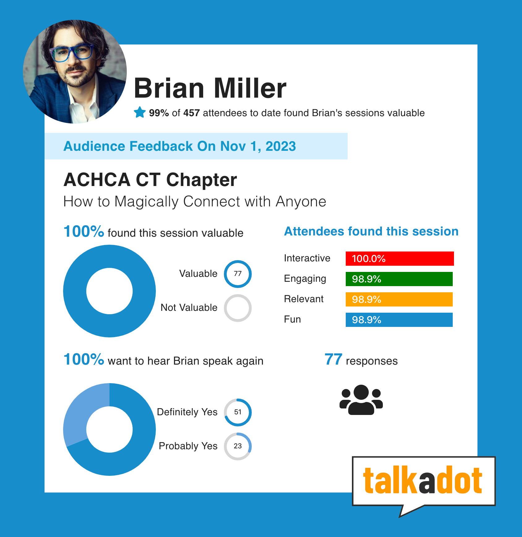
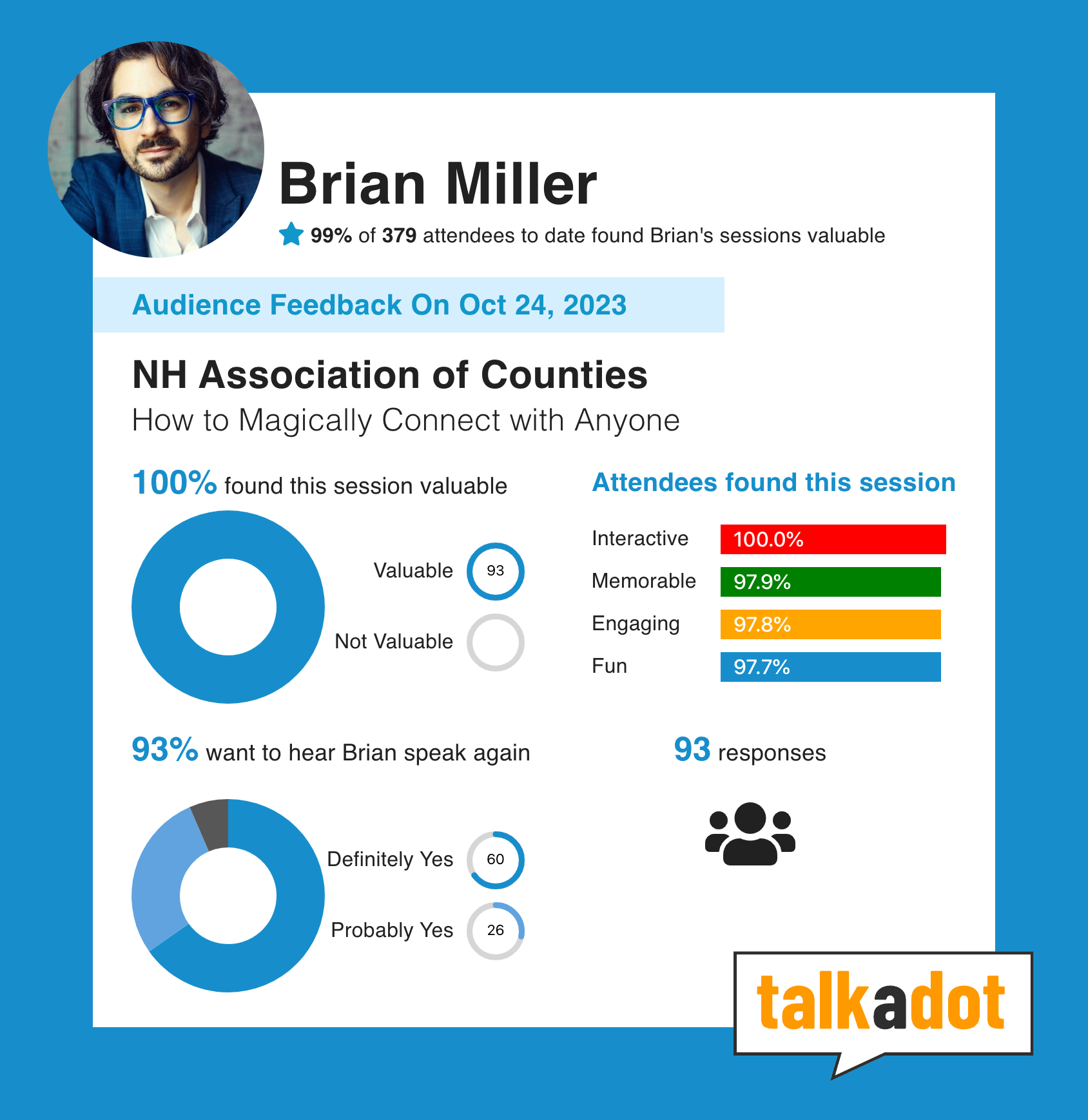
And yet this year when we captured audience feedback, my stats look like this:
99% said the presentation was valuable
95% said they would attend another presentation I was giving
Long presentations AND through-the-roof ratings. How?!
By using slides to create engagement, manage and maintain the audience's energy level. After all if they aren't engaged, they aren't learning, which is a waste of their time and the client's money.
Later in this article I'll discuss precisely how I use slides to create engagement, but for now, let's carry on with reasons I started using slides (and you might consider it, too).
#2 Long keynotes can be treated like hybrid workshops
90 minutes actually gives me the opportunity to incorporate workshop elements into my keynotes, like small group discussions followed by stand-and-share.
Many studies show that we retain information better when we encounter it via different learning formats.
Because I use a deck now, I can place prompts and instructions on slides in order to seamlessly deliver workshop elements. Which means I can vary my teaching style beyond pure lecture, benefiting the audience's retention and making it much more likely they'll actually do something with the information.
#3 Interactive apps require slides
In September 2021 I stepped into an airport for the first time since the pandemic shut down live events.
I remember sitting down at a restaurant and looking for a menu, but there was none to be found. I flagged the server to ask for a menu, and she simply pointed to the table. I looked down and there it was: a QR code. A quirky piece of technology that I thought had died. I pointed my phone's camera at it and immediately a menu popped up where I could order and pay. Beautiful, seamless, and fun!
When the pandemic forced us all to deliver virtual presentations, many of us started playing with interactive tools like polls that could be done in realtime, since the audience was already at their computer. And boy, they worked wonders for engagement.
But on real stages the audience isn't sitting at their computer. Solution? A slide with a QR code.
Stick a QR code on a slide to get the audience involved in an interactive app during your speech. Like a workshop exercise, it's another break from the lecture format that can boost energy and maintain engagement over the long haul, and lead to better retention of information.
Slides will destroy your presentation when poorly designed
According to a survey by Duarte, "4 out of 5 professionals said they shifted their focus away from the presenter during the last presentation they attended."
If you're a presenter, the more your audience shifts their focus from you to something else, the less likely you are to deliver the learning outcomes, create the change you seek to make, or more selfishly, get rebooked or referred by the client.
Despite my newfound appreciation for slides, it's still way easier to get them wrong and kill the presentation than get them right.
Here are some tips for getting them right:
One Big Idea per slide, nothing more
If you put a bunch of info on a slide, the audience will read it instead of listening to you. Or worse, you'll be tempted to read it to them. Either way sucks the life out of a presentation.
Instead, I suggest one point per slide. Usually that means no more than one sentence, or short phrase, per slide. As soon as you feel yourself tempted to make bullet points, try this instead:
Either 1) List each bullet point as its own slide, or 2) set it up so each bullet point appears one at a time. The only thing that should be on a slide is either a Big Idea or a point that directly supports one of your Big Ideas.*
*For keynotes, the rule-of-thumb is one Big Idea per 20-30 minutes.
Slides can function as chapter titles or anchors
The goal of a slide is not to deliver the information, but to tell the audience where we are in the progression of ideas.
Instead of "Human connection is the mutually beneficial exchange of emotional information," I might simply put, "Human Connection" and then talk for 5 minutes, explaining what it is and why it matters along the way.
Steve Jobs was a master of this style. His slides were often a single word or short 3-4 word phrase, set against a solid color, and would stay up for 5-10 minutes while he discussed that particular topic.
Slides can provide great entertainment value
In addition to providing the audience with anchors, slides can also be used to enrapture the audience if viewed as a character in the performance.
Seth Godin is a master of this particular style, often clicking through 50-60 slides in 40 minutes. That sounds like way too much until you realize that almost none of them have words at all. They're mostly picture, gifs, or a short video clip that he clicks through without even looking at them.
Check out Seth using slides here.
His clicks are timed to his words like a choreographed dance.
I've used this to great effect this year. Yes, it takes a lot more planning and rehearsal, but when I'm talking very seriously about the loneliness epidemic and then, without even looking, this gif appears on the screen behind me...

...it's very, very funny.
The contrast between what I'm saying and what they're seeing creates the laugh. And the fact that I don't acknowledge it gives a theatrical air to the speech, leading to audience feedback like this:

So, consider that your slides could be images, gifs, or even video clips.
Make sure prompts and instructions are unbelievably clear
Great, you're going to do a workshop exercise during your keynote. But wait - how are you going to tell a room of 300 people what to do and avoid chaos that you can't recover from?
Answer: Crystal clear slides that hold their hand and walk them through it step by step.
Resist the urge to put all the instructions on a single slide.
First slide, tell them how to form their group or pair.
Second slide, tell them the goal of the exercise.
Third slide, give them the prompt and the length of time.
Leave this slide up while they do the exercise and do NOT put a timer up in place of it (people will forget what they're doing mid exercise, and because this is not a proper workshop you're probably not able to wander the room to answer questions. Leave the prompt on the screen during the entire exercise and time it with your phone or watch instead).
Fourth slide, put up the discussion question for the stand-and-share portion.
You get the idea.
Relieve tech headaches by creating redundancies
Even if you get all of the slide design right, it doesn't alleviate the tech challenges. Using slides introduce many new variables, and each variable is a potential failure.
Here's how I've handled it:
I use my own laptop, adapter, and clicker. It's stated explicitly in my rider and, while you might think makes you seem like a diva, actually provides you with much more control over the tech. My laptop means the slides will look and run precisely the way I designed them with my own software. My adapter means I can carry 1 or 2 backups in case of emergency. And my clicker means both that I'll be using the very clicker I rehearse with, ensuring a smooth performance, and I'll always have the correct backup batteries.
I export my slides to images and store them in the cloud. If they can't use my laptop for some reason, I can direct the event organizer to a folder in the cloud (Drive, Dropbox, etc) where they can download the individual slides as images. That way they can import the slides into their preferred application (PowerPoint, Keynote, etc) and everything will look as it should. If you use Keynote and they use PowerPoint, your slides will get stretched or squashed - use images instead.
By maintaining control over the tech as much as possible by using my own, and keeping a backup of the slides-as-images in the cloud, I've removed a lot of the anxiety and potential pitfalls.
Still, any tech can break, and if it can, eventually it will. I recommend that you are always prepared to deliver your presentation without slides, in case of catastrophic technical failures.
In other words, your slides should only enhance the presentation. They should not be the presentation.
Use your slides to capture feedback, testimonials, and leads
You've noticed images of audience feedback scattered throughout this article. If you're wondering how I managed to collect such specific data, plus testimonials to share across social, in my marketing, and with my clients, the answer is TalkADot.
It's a new app built by speakers, for speakers, to collect feedback and generate leads as a speaker. As long as you use slides, you can use TalkADot.
This is a referral link, which means:
I get $50 if you upgrade to pro
You get a 30 days PRO trial for free, plus a discounted rate when you upgrade to pro
Plus you get an extra $25 off your first year if you upgrade within the first 30 days of signing up!
Everybody wins!
When designed properly, slides create an experience that elevates a speech
If you leverage clear slides, combining Big Ideas and anchors with entertaining images, gifs, and video clips, interspersed with one or two workshop-style exercises and possible even an interactive app like a poll, you will find that you can keep a large audience engaged in a keynote format for 90 minutes without any trouble.
Not only that, the combination of teaching styles will allow you to create a memorable multimedia performance that is likely to be unrivaled by any of your fellow speakers at that event or conference.
So yes, I use slides now, and will continue using them. In fact, I'm having a blast doing it. And judging by the feedback forms this year, so are my audiences.